Showing posts with label Math. Show all posts

Tuesday, July 31, 2012

Have US Incomes Really Stagnated Since the 1980s? (Hint: No)

One of the most common justifications for protectionism, tax increases, government spending or intrusive economic regulation is the "fact" that median incomes in the United States have depressingly stagnated since the 1980s. For example, President Obama in his December 2011 speech in Osawatomie, Kansas stated:
We simply cannot return to this brand of “you’re on your own” economics if we’re serious about rebuilding the middle class in this country. We know that it doesn’t result in a strong economy. It results in an economy that invests too little in its people and in its future. We know it doesn’t result in a prosperity that trickles down. It results in a prosperity that’s enjoyed by fewer and fewer of our citizens.

Look at the statistics. In the last few decades, the average income of the top 1 percent has gone up by more than 250 percent to $1.2 million per year. I’m not talking about millionaires, people who have a million dollars. I’m saying people who make a million dollars every single year. For the top one hundredth of 1 percent, the average income is now $27 million per year. The typical CEO who used to earn about 30 times more than his or her worker now earns 110 times more. And yet, over the last decade the incomes of most Americans have actually fallen by about 6 percent.
President Obama then used his scary median income statistic - and a few others - to justify his calls for all sorts of taxes and Big Government stuff (aka "fairness" and "investments").  And he certainly isn't alone.

Fiscal conservatives typically counter these median income data by noting that the base numbers don't include government transfers and benefits, and these critics definitely have a point.  But Steve Landsburg has an even simpler rebuttal: the overall median income number is a total "racket":
If you’re the sort of person who reads economics blogs, you’ve probably heard that the median US worker has enjoyed hardly any income gain over the past few decades. Here are the numbers behind the noise (all corrected for inflation): 

A mere 3% increase over 25 years does indeed look pretty grim. And note that the year 2005 is pre-crash, so what we’re seeing is not an artifact of the recession.

Now let’s look a little deeper and ask which demographic groups account for all this stagnation. White men? Nope, their median income is up 15%. Nonwhite men? Up 16%. White women? Up 75%. Non-white women? Up 62%. That’s everybody:

If you're like me and have never seen this breakdown before, your mouth is currently agape with surprise.  Landsburg then explains why median income shoots up in every demographic sector while the overall median remains nearly unchanged (emphasis mine):
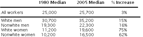
Imagine a farmer with a few 100-pound goats and a bunch of 1000-pound cows. His median animal weighs 1000 pounds. A few years later, he’s acquired a whole lot more goats, all of which have grown to 200 pounds, while his cows have all grown to 2000. Now his median animal weighs 200 pounds.

A very silly person could point out to this farmer that his median animal seems to be a lot scrawnier these days. The farmer might well reply that both his goats and his cows seem to be doing just fine, at least relative to where they were.

That’s exactly what’s happened with median incomes. Each demographic group has progressed, but at the same time, there’s been a great influx of lower income groups — women and nonwhites — into the workforce. This creates the illusion that nobody’s progressing when in fact everybody’s progressing.
After correcting for this very significant demographic change and assuming that 1980's workforce was identical to today's workforce, Landsburg finds that "the overall median income in 1980 would have been $19,600. Today’s $25,700 represents a 31% increase over that corrected figure."

Landsburg noted that he took these numbers from Edward Conard’s new book Unintended Consequences: Why Everything You've Been Told About the Economy Is Wrong.  Another interesting tidbit from that book (along with the aforementioned one about benefits): "The table, because it only shows medians, does not show the explosion in income growth above the median. Fully half of the new jobs created since 1980 have been high-paying professional jobs; prior to 1980, only 23% of jobs were in that category."

That is very important and, again, something that President Obama and his friends conveniently fail to mention.  Landsburg also adds a point of this own: "the table fails to account for the vast increases in leisure time over the past 40 years and the equally vast increases in the quality of the goods we buy. Those things matter too."

Indeed, they do.

Monday, August 24, 2009

Re: Obama's Polls v. The Stock Market

Looks like my post from a few weeks ago on the strong correlation between Obama's falling poll numbers and the surging stock market wasn't as hair-brained as I first thought. Ed Morrissey over at HotAir points out that none other than Jim Cramer is touting Obama's disapprovals as a leading market indicator:


I expect my royalty checks to be arriving in the mail anyday now.

All kidding aside, since my first post the market has continued to rise, and the President's numbers have continued to fall. Maybe once I kick this wicked flu, I get around to updating my analysis to reflect the last few weeks.

Thursday, August 6, 2009

Obama's Polls and the Stock Market: Correlation vs. Causation

To celebrate the President's first 200 days in office, Quinnipiac released a new poll showing the President's job approval rating at a new low - 50%, down from 57% only a month earlier. The poll was just the latest in a brutal string of polls showing the President's approval rating approaching or surpassing the dreaded 50% line. And according to the RealClearPolitics average of polls, the President's approval ratings have steadily declined, while his "disapproval ratings" have steadily risen, since the Spring.

At the same time, the stock market is on fire. Reuters reports today that Goldman Sachs' Abby Joseph Cohen, chairwoman of the firm's investment policy committee, believes we're in a "new bull market" that probably began back in March. Many notable bulls, like Larry Kudlow, agree. Other experts are more cautious or are downright hostile to the bull market idea, but the indisputable fact remains: the Dow has been on tear since it cratered last winter.

A few partisans have suggested that it's actually Obama's plummeting approval ratings that have emboldened the stock market because the decline decreases the chances that his anti-market, high tax policies will be enacted. With this in mind, I've decided to put the "Obama vs. The Market" theory to the test. I gathered weekly data (every Monday since the inauguration and today) on the following:

1) The Dow Jones Industrial Average close;
2) The S&P 500 close;
3) The RealClearPolitics average spread between "approves" and "disapproves"; and
4) Rasmussen's "intensity index."

Now, because basic approval numbers alone don't move - or thwart - policy, I decided to look to the "spread" between general "approves" and "disapproves" and between "strongly approves" and "strongly disapproves" (the so-called "intensity index"). A lot of pollsters and pundits prefer this metric because politicians can be elected - and sadly they often are - with less than 50% approval if their opposition is non-existent. And intense constituent opposition - like that at the August healthcare town halls - can definitely undermine a policy, regardless of whether that policy engenders a lot lukewarm support. (I also see this a lot in trade policy with ambivalent free trade consumers against hardcore protectionist union members.)

I used the RCP average to smoothe out any outlier polls, but because I'm only interested in the trends, not the actual poll numbers, methodological differences between polls (like question phrasing, sample sizes or breakdowns) shouldn't matter anyway. I also used both the DJIA and the S&P 500 in case there was any difference between the two indexes.

Here are my results for the Dow, with trendlines in black (click to enlarge):


Hmm, the trendlines sure appear to show quite the inverse correlation. Now let's try the S&P, again with trendlines in black (click to enlarge):

Pretty similar results.

Next I used Excel to check the "strength" of the correlation between the poll spreads and the market indexes, starting from when the "bull rally" began in mid-March (Monday, March 9, in my dataset). Data are available upon request. Just leave your email in the comments, and I'll send you the whole excel file.

Here's what I found (with size of the correlation, according to this guide):

RCP v. DJIA = -0.719377196 (large negative)
RCP v. S&P = -0.702647419 (large negative)
Rasmussen v. DJIA = -0.567438678 (large negative)
Rasmussen v. S&P = -0.569744972 (large negative)

I fully understand the limitations of calling the correlations above "large" or "strong," especially with the limited dataset and volatility of the polling numbers. However, one must admit that the trendlines are very interesting, and the correlation is certainly there to a pretty significant degree.

Of course, the unanswerable - and far more important - question is whether Obama's imploding poll numbers caused the exploding stock market. I think it could contribute to the market rally (especially in health care and energy stocks), but that's far more a biased free-marketer's hunch than scientific fact.

But that won't stop me from showing off those great charts, of course.

OBVIOUS DISCLAIMER: I'm a lawyer, not a statistician. But I do know how to use Excel, and this is not rocket science.